From desktop to mobile: Is your website optimised?
Web design matters
Introduction
At Revcurv we design and build websites. In particular we specialise in ecommerce websites and online appointment booking software. During the process of the build our team has regular meetings to check and review progress and keep things going in the right direction.
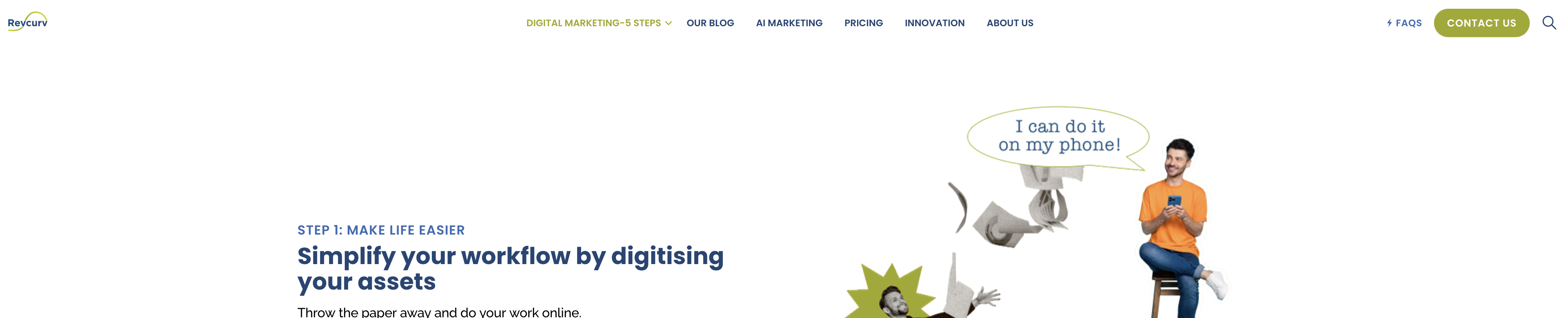
There is one question that echoes through every meeting: ‘How does it function on mobile?’. It’s our mantra. It’s so much at the forefront of our work that it’s the first thing you see when you visit our homepage. If you haven’t noticed it already, hop on over and have a look at the simple cartoon on our main banner about mobile optimisation.
The question of mobile optimisation is asked at every stage of a web build from wireframing and mock-ups through to front end-development and testing.
So why is mobile optimisation so important? As of 2024, about 92.3% of internet users in Ireland access the internet via their mobile phones. The Central Statistics Office states that mobile devices, including ipads account for approximately 80% of all internet traffic in Europe. It’s very possible you’re reading this from your mobile phone. So, given that you now know that almost all people who visit your website are visiting from their mobile phones, can you say for sure that your website offers a functional, smooth, intuitive and enjoyable experience for them?
Because here are some of the problems if it doesn’t.
Desktop vs Mobile: The differences
Screen Size and Resolution
One of the most obvious challenges is the difference in screen size and resolution between desktop monitors and mobile screens. Content that looks great on a large monitor can become cramped and unreadable on a smaller mobile screen.
For example since mobile screens are smaller and longer rather than wider like desktops, content often looks better when presented in portrait rather than landscape. Here’s one such example from our website.

Here's the same content but from a mobile screen. It renders in portrait for a better reading experience. Not automatically though, I'll explain how further down.
Touch vs Click
Another fundamental difference between how users interact with desktops and mobile devices is that while desktop users rely on a mouse to click, mobile users tap, swipe and scroll on touchscreens.
Using a touch screen is a more tactile experience than clicking and with the ability to tap, swipe and even pinch, the interaction can feel more intuitive and dynamic. Because mobile screens are small it’s important to design larger touch targets to accommodate stubby fingers (I’ll speak for myself here). Interactive elements should be easy to tap, incorporate touch gestures where appropriate and make sure that the user interface remains intuitive and responsive.
In contrast, from a desktop the small cursor allows for finer control and smaller clickable areas. Hover effects can also often provide additional interaction feedback which is not possible with touch.
Furthermore with phones being in pockets and handbags it's an overall more intimate connection with the content. When purchasing an event ticket from a mobile for example, users will want to be able to save the ticket directly to their files with a couple of taps, to have ready to produce at the door.
The Earagail Arts festival allowed me to do this in a really intuitive way when I was purchasing a ticket for an event recently.

The ticket itself was adapted to the portrait-oriented phone screen and included a QR code for easy scanning directly from my mobile.
Navigation complexity and the hamburger icon
Users from mobiles are often on-the-go and as such you need to allow for quick and simple interactions. One of the best ways of doing this is to simplify your navigation. Complex navigation systems that work well on desktops may not translate effectively to mobile devices.
Here’s our navigation menu from a desktop screen. From our logo on the left across to the contact us CTA on the right it’s very wide, which is fine for desktop.
Let's take a look at it from a mobile screen.
Introducing....the hamburger icon. You've seen this but you might not know this is what it's called.
The hamburger icon, so called because of its apparent resemblance to a hamburger, is those three lines typically found in the top corner of a phone screen that indicates a navigation menu that can be expanded or collapsed. The hamburger icon helps to save screen space and provide a cleaner interface, especially on mobile devices where screen real estate is limited.
Here's our navigation menu from a mobile using the hamburger icon.

Which expands to this. And collpases again by clicking the X.
It’s compact and easy to navigate. But without the hamburger icon, you would be scrolling across for ever and ever and ever…
The right cms system
These are just some examples of the challenges faced when optimising a desktop for mobile use. Other issues include performance, speed, forms, input fields, third-party integrations and more. To overcome these challenges, you need to use a CMS system that optimises for mobile. At Revcurv, we use Umbraco.
Responsive Design Mode
In Summary
About the author
Revcurv Marketing Experts
Marketing experts in your pocket.